A hospital or a doctor with his/her own practice needs a website as much as an online store does.
Specially during this — CoViD pandemic when everyone is in a line to get on the digital space.
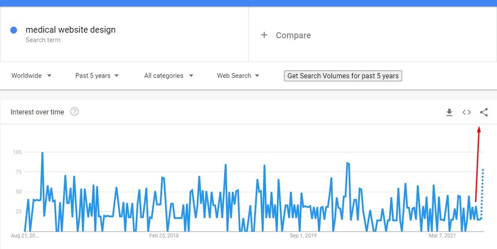
Figure: Search volume trends of “medical website design”
However, doctors or hospital admins don’t have the time to educate themselves on web design requirements.
That’s why they feel totally lost when talking to a web design agency about their websites.
They don’t know how their website should look like, what features it should have, and most importantly, how to make their site usable for their prospects.
Well, worry no more.
— We have made a list of 10 useful doctor/medical website designs
Stay with us. Also, you may find some similarities in medical and business website designs.
Here are the 10 medical websites to inspire you
Before we begin the journey, we thought we would tell you the names of the 10 websites.
Here they are:
- Rush
- Advent Health Neuro Institute
- Babylon Health
- Hopkins Medicine
- Mount Sinai
- Mayo Clinic
- Royal Adelaide Hospital
- Olathe Health
- Medcorder
- Health blog of Cleveland Clinic
1. Rush-A frontrunner medical website

Rush hospital’s website is one of our favorites. Created with Drupal, it is one of those websites that was designed with users in mind. You will find professionalism in everything from site content to navigation. Overall, this is an ideal medical website to outshine your rivals in Bangladesh.
What do we love about Rush?
There are lots, to be honest.
Here are some of its best features:
- Scheduling appointments made super easy (the CTA is in the banner section)
- Easy to find doctors by medical condition and location
- Honor badge in the hero image
- Engaging imagery
- Responsive on all devices
- Donation collection feature
- Hamburger menu to access all the crucial pages
- Well-crafted footer
- App download links
How can Rush be a better medical website?
Rush is not free from areas of improvement.
Here are some they should address:
- The navigation bar should be sticky
- It should have a blog to educate on various medical issues
- Dynamic design concepts like parallax scroll will make it a lot more engaging and may lead to higher conversion.
Website: https://www.rush.edu/
2. Advent Health Neuro Institute-A site that is both attractive and usable

The website of Advent Health Neuro Institute is another fine example for hospitals and medical institutes. Like Rush, it is also created with Drupal. The site designers have taken special care to reflect a soothing vibe across the website. In addition to aesthetics, this hospital website has also been optimized for conversion. A fine example for web designers working on doctor and clinic websites.
What are the best features of Advent Health?
The following are the most notable features of this healthcare website:
- Clearly visible CTAs
- Good choice of fonts
- Full-width above-the-fold banner
- Specific neurological conditions that the institute treats in grid view
- Location of all its hospital branches
- Newsletter subscription
- Resourceful footer
- Clickable phone number (calls can be placed right from the website)
What part of the site does Advent Health need to improve?
Advent Health site should have:
- Suitable thumbnails for the neurological conditions
- More content to add weight to the home page (will help with SEO)
Website: https://www.adventhealthneuroinstitute.com/
3. Babylon-A modern medical website

Babylon Health’s website has embraced simplicity to the fullest. Our content writer came across this one after searching for frantically searching for healthcare websites. After our designers browsed through it, they placed it on our list of effective medical websites. It has one of the highest contrasting color palettes. It doesn’t end there. It blends easy navigation with user-friendliness in an amazing way.
Do consider it before going forward with your doctor’s website design.
What do we love about Babylon Health?
Here are the features of Babylon we love:
- Lots of white space (felt so relaxing browsing through it)
- Reviews from real users
- Sliding logos of top publishing houses that featured it
- Extensive footer
- App download link
- Responsive in case you were wondering
- Ratings for social proof
- Career button in the navigation bar
And their areas of improvement?
Here are what Babylon should address:
- It should have more hover-sensitive animations
- The user reviews should have images of the reviewers
- More images and content on homepage
- There should be a blog section for thought leadership (and drive organic traffic)
Website: https://www.babylonhealth.com/
4. Johns Hopkins-A feature-packed hospital website

There are very few people on earth who haven’t heard about Johns Hopkins. It is not just a hospital but an academic institution with superior research facilities. So you have an idea how resourceful its website will be. In addition to features, the site designers have kept user experience in mind. The result is an exemplary site Bangladeshi medical service providers will find immensely inspiring.
What makes Johns Hopkins site useful?
The scope of this discussion doesn’t allow us to mention every functionality of this site.
So, we are going to list the most effective ones.
Here they are:
- Live chat feature
- Intuitive design
- Easy to find health info and doctor
- Easy to schedule an appointment
- A separate section dedicated to billing information
- Compressed menu bar (the only site on our list to have implemented)
- Search option with popular terms
- Sliding promo content
- Relatable simple text
- Links to career information and donation collection
- Resources for patients, students, health professionals and researchers
- Support for many languages
What should Johns Hopkins improve?
There are very few areas to be honest.
Those are:
- the above-the-fold section must be more engaging.
- The app download link should be easy to locate
Website: https://www.hopkinsmedicine.org/
5. Mt. Sinai-A well-rounded medical website

Remember Mt. Sinai Hospital? Yes the one in NY that repeatedly made it to the headlines in 2020 for its intense fight against the corona pandemic Well, it happens to one of the biggest teaching hospitals in the USA. And oldest as well. Their leading position in the medical industry is well-reflected in its web design.
In terms of features, we have found it to be a close competitor of Johns Hopkins.
Prominent hospitals in Bangladesh such as Dhaka Medical College, PG Hospital, and Birdem Hospital will find this site design suitable.
What do we love about Mt. Sinai website?
Here are the features of this website that we love:
- Lots of sliders
- Appointment scheduling in the navigation bar and above the fold
- Option to search doctors by specialty and location
- A separate service section
- Press release section
- Mega menu
- Sticky navigation bar
- Twitter feed embedded on site
- Resources for patients, researchers, and health professionals (like Johns Hopkins)
- Support for multiple languages
- Option to make donations
What can be improved on this site?
There are 2 things that we believe Mt. Sinai should improve.
Those are:
- Font size should be larger for the service section
- It should have a blog to educate people on healthcare issues
Website: https://www.mountsinai.org/
6. Mayo Clinic-A site that embraces simplicity

Mayo Clinic’s website has simplicity at its core. That’s what you will think when you browse through the site. That’s one of the reasons this website is listed on several articles on “best doctors website design”. Let us be honest here. It’s not our most favorite clinic site. However, its layout and the information it offers its users easily make it a follow-worthy design for healthcare institutions in Bangladesh.
What do we love the most about the Mayo Clinic website?
Here are the features that Bangladeshi clinics and teaching medical colleges will massively benefit from:
- Unique and extensive navigation bar design
- All crucial info is in the above-the-fold region
- Alphabetical arrangement of all diseases and conditions
- A separate section for COVID-19 infection and vaccine info
- Dedicated “Why Choose Mayo” section
- Location of its other clinics
- Separate resources for researchers, students, and employees in the footer (a standard clinic website feature)
How can the Mayo Clinic website be better?
As we said before, it’s not our most favorite healthcare site layout.
So, we have listed several areas Mayo Clinic must improve.
Those are:
- It needs more human images (specially in the “why choose Mayo” section)
- More hover sensitive and subtle animations will make it more comfortable to use)
- The search option should be more sophisticated (include most searched topics, filters)
- The navigation bar should be sticky
- There should be a latest news section
Website: https://www.mayoclinic.org/
7. Royal Adelaide Hospital-An elegant and clutter-free website

Royal Adelaide Hospital (RAH) has a site any hospital will be proud of. It is free of any clutter which is what made us fall in love with it. The site design doesn’t feel bloated at all while offering all the crucial info the users may need. On top of all that, it is beautiful and soothing for the eyes. Hands down one of the most modern hospital websites we have come across lately. A modern design that hospitals in Dhaka and other parts of the country will find outstanding.
What are the best features of the RAH site?
There are plenty.
The following are the ones we love the most about this site:
- Large images (very bold for a hospital and it doesn’t feel out of place at all)
- Large font size which makes it very easy for the eyes
- Subtle yet creative animations that add to the brand awareness
- Easy to notice emergency section (large red box on the top right)
- A section that tells users how to come to the hospital (this feature has set it apart from any other medical websites)
- Large search bar
- Offers virtual tours to users
- Clickable contact info (lets you call the number directly from the website)
- Button at the bottom to auto-scroll to the top
- Support for people of different cultures and languages
- Latest news section
- Separate COVID-19 info section at the top
How can RAH improve its website?
Being a web design and development agency, we are in the habit of always scrutinizing websites.
RAH was no exception to that. Despite its amazing design, there are areas that, if improved, will make the website truly outstanding.
Those are:
- Fonts like JAF Bernina and freight text would have been a better choice
- The top navigation bar should have pop-out menus and be sticky
Website: https://www.rah.sa.gov.au/
8. Olathe Health-A neat WordPress medical site

Most of the medical websites we have talked about today are built with Drupal or Craft CMS. Olathe Health is an exception. It is a WordPress site built with a custom theme. The first thing we noticed about this hospital site is its clean above-the-fold region. And of course the video in the banner section. In that respect, it stands apart from all the sites here.
So, what do you love about the Olathe Health website?
The following are the things about this site we love:
- Large visible buttons in above the fold that lets users find clinic locations, find a doctor, go to the patient portal, and bill payment.
- Fully responsive (we tested)
- Promo section with the number of locations, years of service, and healthcare service providers
- Separate resource section for patients in the footer
- Scheduling appointment
- Clickable contact info
- It has a blog
Areas of improvement?
There are quite a few areas Olathe Health should resolve.
Those are:
- Large text blocks that do not add to the value of the site (in below-the-fold section)
- There should be the latest news section
- An “emergency section” is crucial for users
- The “Get Care” button at the top should be larger
- The issue of the search box covering the entire window for mobile devices should be fixed.
- The content hierarchy needs improvement
- The COVID-19 section should have a highly contrasting color
Website: https://www.olathehealth.org/
9. Medcorder-A modern website for a health app

Medcorder is a health app that is easy to use for everyone. And that’s the theme of their website. From the choice of images to text font, you will get a relaxing vibe. Among all the health websites we have reviewed for this discussion, the layout of this one is the simplest. The visual nature of this website made us guess that it’s developed with Webflow. And we were right.
What have you found amazing about Medcorder?
Here are the following we have found great about this site:
- Adequate focus on the app download links in the above-the-fold section
- Reviews from users for social proof
- A video review that brings diversity in the site content
- Showcases the best use cases of the medical app
- Newsletter signup
- Has a blog and FAQ section
- Colorful and engaging imagery
What are the areas of improvement for this health site?
There are several areas of improvement we have listed for Medcorder.
Here they are:
- It should have images of the reviewers
- Web design techniques like parallax scroll or fixed background scroll will make it far more engaging
Website: https://www.medcorder.com/
10. Cleveland Clinic Health Blog-A standard health blog website

Cleveland Clinic health blog has a layout that health bloggers in Bangladesh will find useful. Along with informing people on health issues, it also lets you find doctors and book appointments. The blog is packed with information while being well-organized. There is more. The visual and content hierarchy is definitely mention-worthy.
What are its best features?
We have found the following to be not just great but essential for a health blog.
Those are:
- It has lots of images
- There are hover animations all over the site
- COVID section with in-depth articles
- A COVID bar at the top for a vaccine appointment
- Extensive footer
- As you may have guessed, it is fully responsive
- Categorized articles on the homepage
- A ton of blog articles covering a wide and diverse range of medical and healthcare issues
- Large search bar
- Options to find a doctor and book appointment in the navigation bar
- Hamburger menu with links a world of information
How Cleveland Clinic blog be better?
It can do so by taking care of the following.
Here they are:
- The subscription section and the CTA should be sticky on either side
- The buttons to find doctors and book appointments should be larger
- The menu button in mobile view should be made more visible
Website: https://health.clevelandclinic.org/
Healthcare and doctors websites need a massive upgrade
Medical websites in Bangladesh have a long way to go in terms of usability and user experience.
— For that purpose, hospitals and clinics here will need to give up the idea that a website is just a digital banner. With a solid design plan and long-term goal, a Bangladeshi medical website will be able to outshine among its rivals, gain the trust of people and deliver faster service.
If you are thinking about having a website for your healthcare institution, then feel free to reach out to us. We love to offer suggestions on web design.